
Learning how to set a clear brief for branding design
Setting a clear brief for your designer before starting a job is imperative to ensure you get the most out of your branding. It’s understandable to have no idea what you want in the beginning, after all it’s the job of the designer to make your vision come to life. But that can be difficult when an unclear brief has been assigned. I’m going to go through a few tips on how to create a brief to get the most out of your designer and branding assignment.
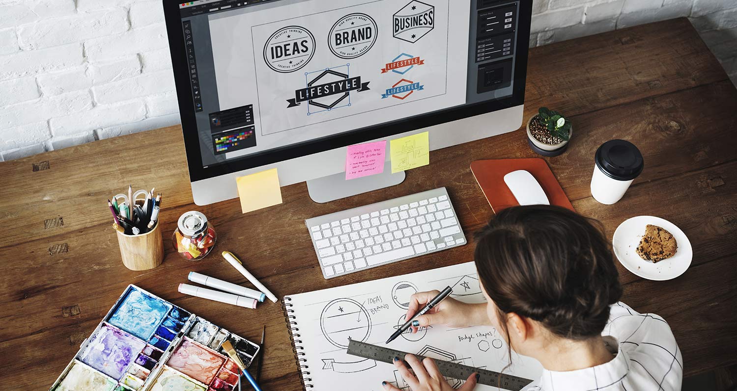
The first advice I give to clients looking to re-brand or start a new brand is to look at inspiration. Have a look at your competitors, what’s been done already and how might you stand out from the crowd? Have a look on logopond.com to see whether you can find a style that you like and put together a mood board based on how you see your brand. This will give the designer an idea about the direction you’re heading in instead of giving vague details and ending up with, for example, a tree instead of a table. Clear communication is key.
Understanding the way colours make us feel can be an important part of choosing this important aspect of your branding. A basic overview of the psychology of colours is outlined in the graphic below. (insert a graphic with this information):
Red is a powerful colour and can imply passion, energy or danger. It is found in many fast food chains (McDonalds, KFC, Hungry Jacks) as it has been found to stimulate appetite.
Green is a colour widely used by health and organic food companies to express healthy or environmentally friendly products.
Blue is used in many corporate logo designs as it promotes a feeling of loyalty and trust.
Orange is seen as a young, fun colour that can represent health, energy, warmth or excitement.
Purple magic, supernatural, royalty, creativity
Pink tranquillising, feminine, floral, love
Yellow sunshine, happiness, optimism, caution
This is just a basic outline explaining the psychology of colours. There may be a specific colour that you would like to use in your branding because of the feeling behind it. Or perhaps you’re unsure and would like to see your logo in different colours. If you explain the meaning behind your brand and the emotions you would like to represent, your designer can present different colour options for you.
Overall, the most important ideas and concepts to think about and communicate and share with your designer include:
- Identifying your competition and how you could differ from their branding approach
- Inspiration Mood Board (including other logos and possible colour combinations)
- The feeling you’re trying to represent through your branding
If you follow these guidelines, your designer will have a clear idea about what you’re trying to portray through your branding. This means that you’ll get the most out of the process and won’t have confusing emails sent back and forth. It’s important to ask your designer any questions you have about the process. If you’re totally unsure what you want, it might be a good idea to give your designer a call to clarify the process. Clear communication is key to a successful branding project.